
Review fine black lettering and a broad black background as separate features before asking for a darker sticker. Have the receiving printer confirm the required color handling for each feature in the actual export. A global darkening instruction can leave the team approving a change whose effects on the smallest details have never been checked.
This matters when decorative or promotional artwork combines a bold dark field, a small wordmark and pale details inside that field. Start with those visible jobs. A black swatch name or a phone preview does not establish how the finished sticker will look.
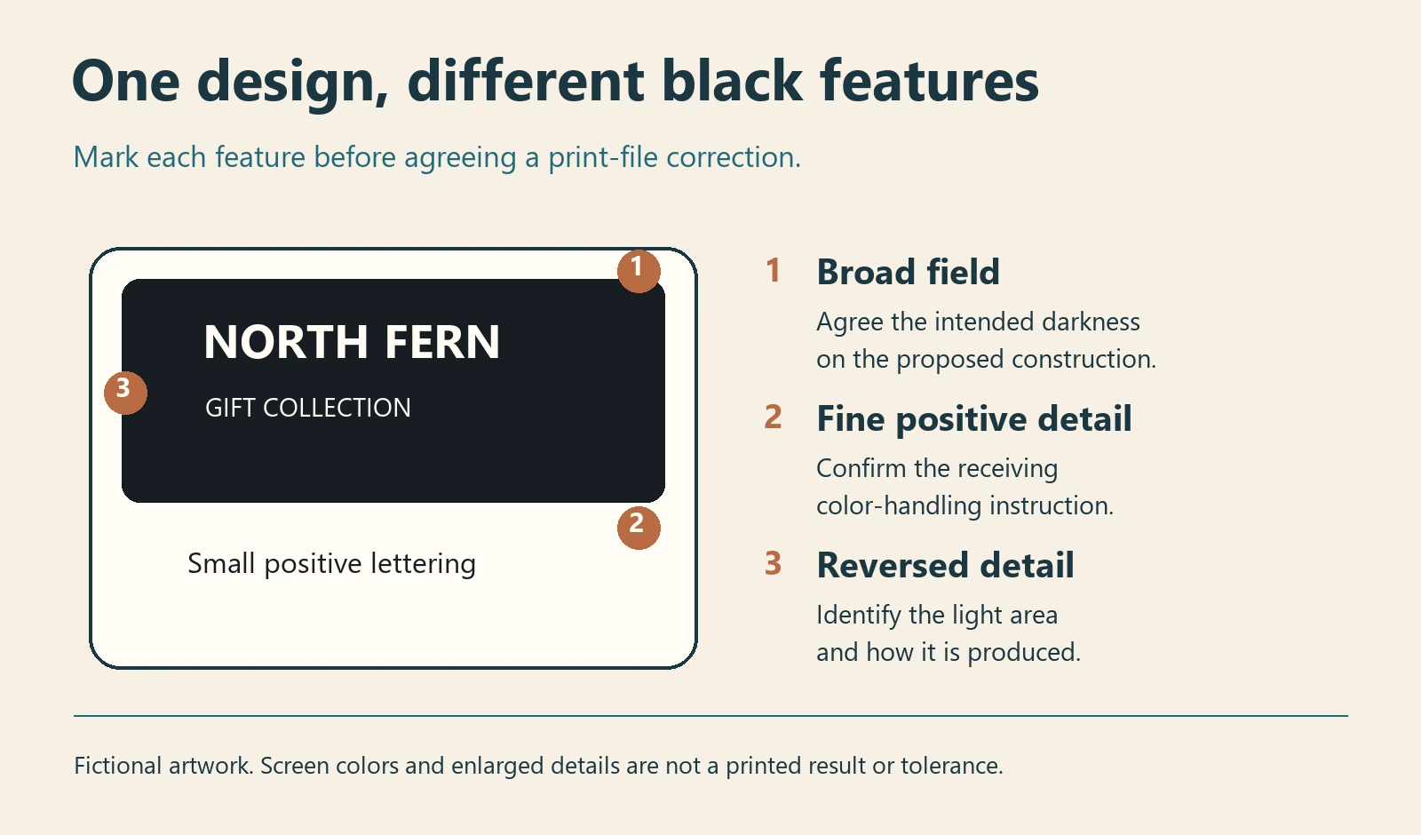
Mark the features before choosing a correction
Give the designer a marked copy at final dimensions. Identify positive black letters or lines, larger solid areas, and light details reversed out of the dark area. Include neighboring images where two black-looking regions meet. Those regions may have different contents even when the screen makes them look similar.
For an illustrative gift sticker, the buyer might prioritize the small brand name remaining legible and the large background having an accepted dark appearance. These are two acceptance questions. A proposed correction should say which feature it addresses and what else needs rechecking.
| Feature to mark | Question to return to the designer and printer |
|---|---|
| Small positive black text or line | What color content should this feature have in the receiving workflow, and does the export retain it? |
| Broad solid field | What black treatment is appropriate for this construction and the accepted appearance reference? |
| Light detail within that field | Is it unprinted substrate, an opening in the artwork or separately specified printed white? |
| Adjacent black-looking image and vector area | Are their intended appearances coordinated, and what conversion or proof comparison is required? |
Keep the technical choice specific to the print route
In a CMYK workflow, process black is K; a rich black includes K and one or more process color inks. Adobe describes rich-black warnings for unintended use on type and explains how Output Preview can inspect separations and objects. It also advises asking the print provider for the applicable total ink-coverage limit. These tools help identify file content; they do not certify the finished print. See Adobe’s output-preview documentation.
There is a practical reason to avoid copying a formula from an unrelated job. Hartmann’s published printing specification treats small text as a one-color preference and gives different black-treatment instructions for its offset label and molded-fiber routes. That is a scoped manufacturer example, not a ZC Labels specification. Its ink values, type sizes and tolerances should not be transferred to this order.
A single-color instruction may be appropriate for fine positive detail when confirmed by the receiving printer. A different treatment may be proposed for a large field. If the agreed route handles RGB conversion, spot colors or another arrangement, obtain its instructions instead of forcing the whole design into a generic CMYK recipe. Do not add an unspecified extra black ink merely to make the brief sound more precise.
Inspect the delivered export, not only the source swatches
Ask the artwork owner to inspect the actual file being handed over, using the receiving workflow’s appropriate tools. Keep the export revision, the marked feature and the finding together. Where a separations review is relevant, ask which inks contain the positive text and which contain the large field. Record the intended result and any discrepancy.
The designer should also identify whether a black-looking feature is vector content or part of an image. An instruction applied to one vector swatch may leave a placed image unchanged. The artwork file handoff guide explains why a document extension alone cannot establish its contents.
Do not approve by turning off inks until the screen looks pleasing. A review view is evidence about the file under the stated conditions; the receiving printer must confirm whether its production handling agrees with that intention. If a correction changes overprinting or white-object behavior, use the output correction record for that separate issue.
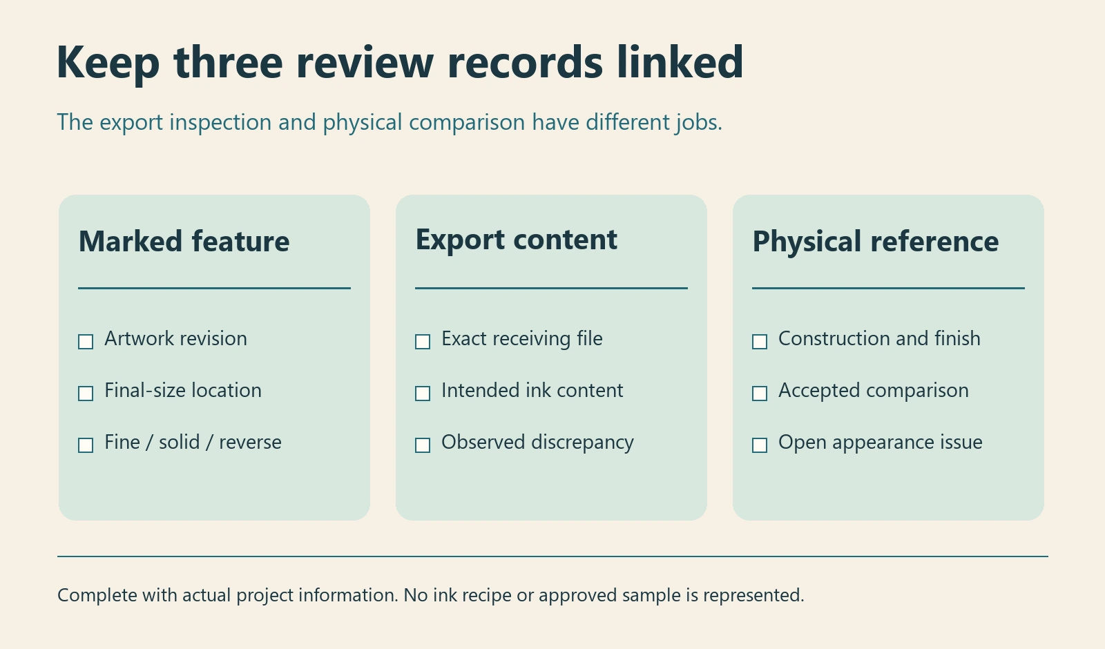
Give the physical comparison a defined job
If the concern is that a printed black appears too light, retain the actual comparison pieces and identify their materials, finishes and print histories where known. Compare under agreed conditions. A photograph can show the area of concern, but it cannot establish its cause or supply the missing construction record.
Ask which physical reference is needed to assess the solid area and the smallest required detail on the proposed construction. The color-reference guide covers the controlling reference and viewing conditions. A clear or holographic construction may also require an identified white-support arrangement; avoid treating the screen’s white background as a production instruction.
A softer edge can have causes beyond the black build. Keep an observation such as “the small lettering differs from this retained reference” separate from a diagnosis. Changing all inks, finish and artwork at once makes the comparison harder to interpret.
Choose the release that the evidence supports
Retain the existing artwork when the receiving file review and agreed physical comparison support it. Revise a named feature when its intended content differs from the receiving instructions, then inspect the replacement export and affected neighbors. Hold that feature’s approval when the print route or comparison reference remains unresolved.
Keep the accepted export and feature notes with the order. A later instruction to make the background darker should reopen the affected areas rather than silently changing every black object. Confirm sample scope, availability, charges and timing under the current sample policy.
For a custom die-cut sticker review, send the final-size source and export, mark the fine text and large black areas, identify the proposed material and finish, and include any retained printed reference in a black-artwork enquiry. State whether the unresolved question is file content, printed appearance or both.