
A promotional sticker is described as bright at night. The artwork could mean fluorescent color, retroreflective material or a glow-in-the-dark effect. Those mechanisms need different lighting conditions. Before selecting a decorative sticker, identify what the viewer should notice and where the light comes from.
This guide covers decorative project planning. Regulated safety, road, protective-equipment and emergency applications need their own responsible specialist and applicable requirements. A bright-looking sample or material name does not establish suitability for those uses.
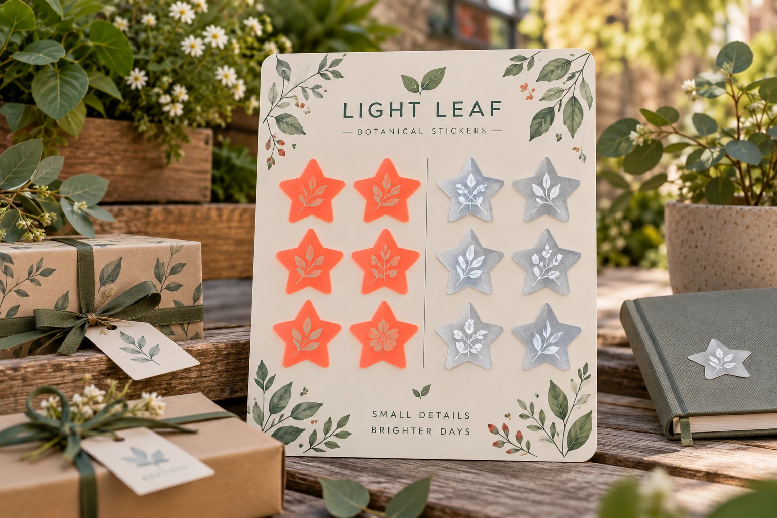
State the intended lighting task
Fluorescent color can provide a conspicuous daytime appearance. Retroreflective material returns incident light toward its source, so the observer's position relative to that source matters. Photoluminescent material has a separate light-exposure and afterglow task. 3M's explanation of retroreflection distinguishes these mechanisms. It does not approve an unidentified decorative sticker or its claimed visibility.
Describe whether the use is a daylight retail display, a hand-held item photographed with flash or another actual situation. A bright phone-flash photograph can favor a reflective effect because the camera and light are close together. It cannot establish how a person standing elsewhere will see the piece.
Record the light, observer and surface positions
For a representative comparison, identify the light source, its position, the viewing position and the sticker's orientation. Keep those relationships consistent when comparing samples. Ask the material provider which method is appropriate if a quantified optical property is required; a desk demonstration is not a standardized measurement.
| Requirement | What the brief should name |
|---|---|
| Daytime color emphasis | Relevant light and approved color reference |
| Return toward an external light | Source, observer and sample arrangement |
| Effect after the light is removed | A separate charging and afterglow review |
| Required information | Which text or mark must remain recognizable |
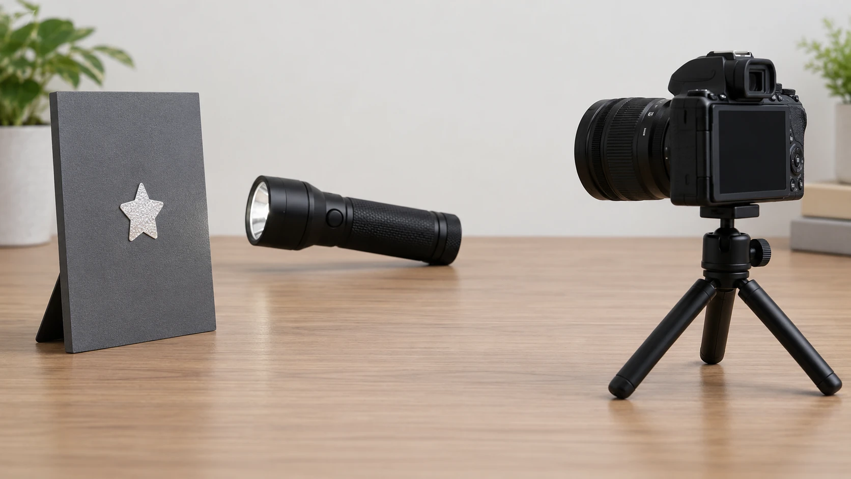
Compare the printed sample with the bare material
A bare reflective swatch does not represent every printed design. Identify which areas are printed, left exposed or covered by a finish, then ask the supplier how the full construction affects the intended effect. Keep small essential wording separate from a decorative treatment if the sample makes it difficult to read.
Look at the ordinary unilluminated appearance too. A material chosen for a special-light effect still has a daytime color and surface. If the artwork must match a brand reference, define which viewing state controls that acceptance rather than expecting one color to look identical under all light arrangements.
Review application separately
Give the provider the actual surface, shape and use conditions. Curvature changes viewing orientation as well as attachment. A reference held flat is incomplete when the finished sticker wraps around a curved item. Ask for a representative application review and retain both optical and attachment observations without treating either as proof of the other.
Use the outdoor durability guide for exposure evidence and the surface-matching brief for contact details. They answer different questions from the lighting arrangement here.
For a decorative effect enquiry, send the intended light and viewing situation, final artwork, exposed-effect areas, dimensions, application surface and quantities. Ask which offered construction can be represented by a sample and which claims its documentation supports before approving the project.