
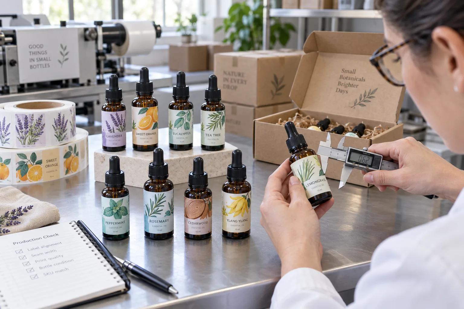
Small amber bottles make artwork look easy on a screen. The designer sees a neat rectangle. At the packing table, we see a narrow cylinder, a shoulder that starts early, a base curve, a label seam and fingers that may carry oil.
That difference matters. Most essential oil label problems are not caused by a lack of decorative ideas. They come from trying to fit too much information onto too little straight glass, or from treating an oil-handled bottle like a dry stationery product.
Find the Usable Height, Not the Bottle Height
Measure from the point below the shoulder where the diameter becomes consistent to the point above the lower curve. That is the label's working area. A wrap that reaches into either transition can wrinkle or lift. Check several bottles because molded glass and supplier tolerances are not perfectly identical.
Wrap a paper prototype around the bottle and mark where the seam lands when the product name faces forward. Keep the seam away from the main botanical illustration and any required text. If a barcode or batch field is part of the job, confirm whether it remains readable on the curve.
| Design pressure | Factory-side concern | Better decision |
|---|---|---|
| Long product story | Text becomes too small | Move secondary content to a carton or insert |
| Full-height wrap | Label enters shoulder and base curves | Use the measured straight panel |
| Oil on hands | Surface contamination and print wear | Clean application plus realistic handling test |
| Many similar oils | Picking and packing errors | Consistent layout with strong visual SKU cues |
Small Does Not Need to Mean Blank
A tiny bottle can still carry useful original graphics. A line-drawn lavender stem, citrus slice, eucalyptus branch or cedar ring can identify the oil faster than a paragraph. The illustration should remain simple enough to survive reduction and should not compete with the product name.
We usually favor one visual system across the range: botanical illustration in the same zone, one strong accent color, consistent type hierarchy and a stable back-information grid. This looks intentional in a gift set and helps the packing team distinguish similar amber bottles.
Oil Resistance Begins Before Application
No label performs well when it is applied over oil. Bottles should be clean and dry, and the filling workflow should prevent drips from reaching the label panel. After application, test the bottle with the actual oil and cap system. Tip it, handle it and wipe it using the real routine.
Material and finish can help with occasional contact, but they do not replace clean filling. A protected film label may suit frequent handling. A paper direction may suit a boxed, dry-use presentation. The choice should follow the product route and desired appearance rather than a broad claim such as oil proof.
Keep Claims Separate From Decoration
Botanical pictures show identity; they do not prove therapeutic performance. Avoid using medical symbols, approval seals or language that implies a treatment unless the responsible brand has completed the necessary review. The same restraint applies to organic, pure and certified wording.
Required content varies by market and how the product is classified. We can flag text that is visibly too small or too close to the cut, but final legal content remains the brand owner's responsibility.
Our Small-Bottle Test List
- Measure straight-panel height and circumference on several bottles
- Make a paper wrap and mark the final seam
- Print artwork at 100 percent and judge actual text size
- Apply labels to clean bottles using the real workflow
- Fill, cap, tip and handle with the actual oil
- Inspect seam lift, staining, abrasion and readability
- Compare every scent color and botanical illustration
- Test the complete gift box if bottles are packed together
What We Would Put in the Quote Request
Send the bottle and closure specification, usable label dimensions, bottle quantity, SKU count, quantity by oil, artwork, expected oil contact, application method, finish direction and any carton or gift-set layout. Include the smallest text at final size, not only an enlarged screenshot.
A strong essential oil label respects the container. It uses compact original art to create recognition, leaves breathing room for the information that matters and proves its construction on a bottle that has actually been filled.