
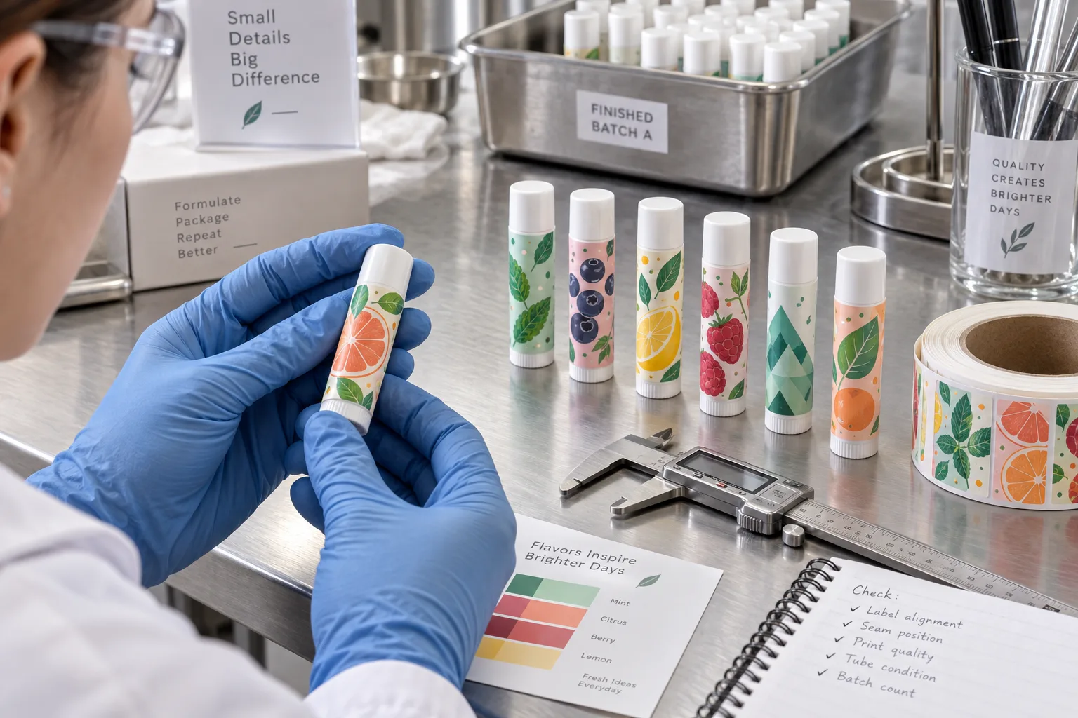
A lip balm label looks simple until the artwork is placed at actual size. The logo that felt restrained on a jar becomes dominant, the flavor name loses room, and the seam lands through the most important icon. Small packaging does not forgive vague hierarchy.
From the production side, we do not begin by shrinking a cosmetic label. We begin with the tube. Its cap, twist base, molding line, taper and usable cylinder define the label. The design then has to perform inside that narrow strip.
Measure the Tube That Will Be Filled
Tube specifications can vary by supplier and even by style within one catalog. Measure circumference with a flexible strip and confirm usable height between the cap and base. Check whether the tube narrows, whether a ridge interrupts the panel and whether the cap overlaps the proposed label.
Decide whether the wrap should meet with a small gap or overlap. A gap reduces the risk of adhesive bonding to the label face, but it exposes the tube. An overlap gives more coverage but creates a thicker seam and requires compatible surfaces. There is no honest universal answer without the tube and material.
| Detail | Typical conflict | Production question |
|---|---|---|
| Usable height | Label touches the cap or twist base | How much clearance remains after assembly? |
| Wrap width | Unexpected gap or excessive overlap | What is the measured circumference? |
| Seam position | Important artwork disappears | Where should the back panel and seam sit? |
| Surface condition | Oil or release residue reduces bond | How is the tube stored and cleaned? |
Design for the Thumb, Not the Zoom Tool
The tube is viewed in a hand, not at 400 percent magnification. Original citrus slices, mint leaves, berries and simple geometric flavor icons can make each SKU recognizable without requiring borrowed characters or an empty white label. The artwork must be simplified enough to survive the print size.
Print a paper proof at actual scale. Wrap it around the tube and rotate it naturally. If the product name, flavor cue or essential instruction only works when the tube is held in one precise position, the hierarchy is too fragile.
Use the Seam as Part of the Layout
The seam should normally live in a controlled back area. Keep small text, barcodes and critical icons away from the overlap or gap. If several flavors share one template, lock the seam panel so new artwork cannot drift into it during routine edits.
Seam lift is not always an adhesive failure. An oversized label may keep springing open. A label applied over dust, oil or a cold tube may not develop contact. A very stiff construction may resist a small diameter. Diagnosis starts by inspecting the failed location, not by ordering a stronger adhesive as a reflex.
Color Can Organize SKUs, but It Needs a Rule
Small tubes benefit from quick recognition. Let one controlled visual element change by flavor: a fruit illustration, color field or icon. Keep the brand mark, information order and main proportions stable. This is faster for buyers to scan and safer for production files.
Record the approved colors as references, not promises that every screen and material will look identical. White film, clear film, matte finish and gloss finish can change the same artwork. Review a printed sample when color separation between SKUs is commercially important.
A Practical Lip Balm Label Test
- Measure tubes from the final supplier
- Check cap and twist-base clearance
- Wrap a blank at the intended width and mark the seam
- Print artwork at actual size and rotate it in the hand
- Apply to clean tubes using the planned process
- Inspect seams after dwell time and repeated handling
- Expose samples to expected oils and temperature conditions
- Verify every flavor code and retain an approved set
What We Would Put in the Quote Request
Send a physical tube or accurate drawing, usable height and circumference, artwork, quantity by flavor, gap or overlap preference, material and finish direction, application method and packing arrangement. If tubes are already filled, describe their surface condition and storage temperature.
A small label should not be treated as a blank strip with tiny text. Give it a clear original visual cue and a disciplined hierarchy. On this package, restraint is not the absence of design. It is the design.