
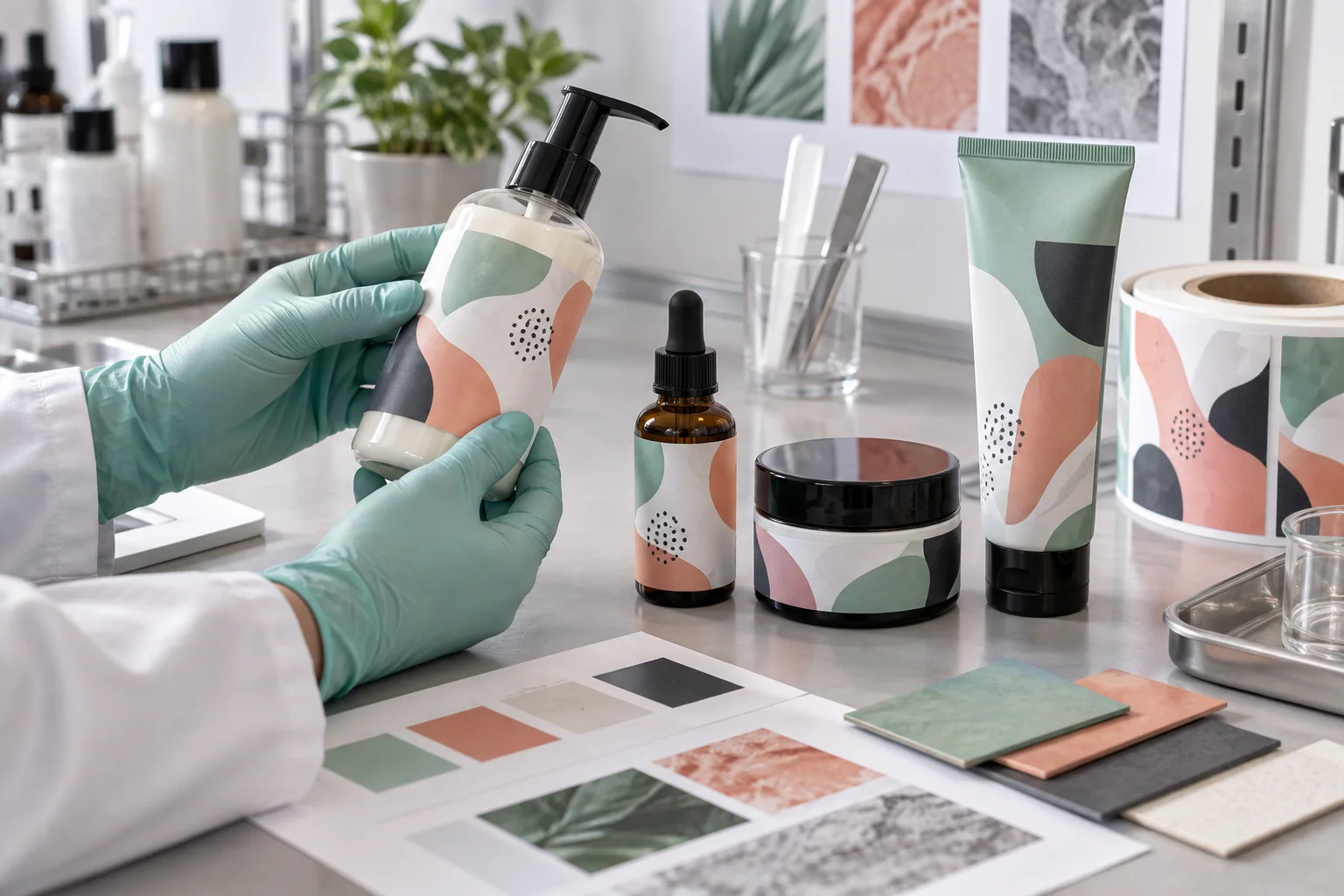
A cosmetic buyer often sends one artwork system and four containers: pump bottle, dropper, jar and soft tube. On the presentation board they are a family. On the production table they are four separate jobs.
The rigid jar gives the label a stable wall. The small dropper bottle limits readable space. The pump bottle may meet wet hands. The tube is squeezed until every weakness becomes visible. Treating them as one SKU with four sizes is tidy for the spreadsheet and careless for the package.
Map the Container Family Before Designing Labels
Measure the usable panel on each item. Record diameter, taper, seam, shoulder and the area touched during use. A label should not bridge a strong curve simply because the front artwork needs more room. If mandatory information cannot fit, the packaging architecture may need a back label, carton or different label shape.
| Container | Main production concern | Useful first test |
|---|---|---|
| Pump bottle | Wet handling, curve and product drips | Filled-bottle use and wiping test |
| Dropper bottle | Small diameter and limited text area | Final-size readability and edge test |
| Cosmetic jar | Short panel, lid handling and oil contact | Open-close cycle and product-contact simulation |
| Flexible tube | Squeeze, recovery and repeated bending | Compression cycle on the actual tube |
Water Resistance Is Only One Line on the Brief
Bathroom use may involve condensation, wet hands, surfactants, oils and repeated rubbing. A buyer who asks only for waterproof labels can still receive a construction that dislikes face oil or a tube that flexes. Define the contact instead: occasional splash, daily shower storage, oily formula, alcohol-based cleaner or travel abrasion.
The test should include the print and finish as well as the adhesive. Look for smearing, color change, scuffing, edge lift and trapped moisture. If a transparent label is used, watch how product color and bottle color change readability.
Small Text Needs a Hierarchy, Not a Miracle
Cosmetic artwork can become crowded with product name, directions, ingredients, quantity, symbols, company details and batch information. The label producer can flag text that appears too small or too light at final size, but the brand must decide what content is required and obtain appropriate regulatory review.
Prioritize legally and commercially important information. Use the original vector text where possible. Avoid relying on a pale hairline font over clear film or a patterned background. Print a paper-size mockup at 100 percent and wrap it around the container before proof approval.
Clear Labels Demand More Decisions
Clear film can make decoration appear printed directly on the package. It can also allow dark liquid, colored plastic and the back label to interfere with the design. White ink may be needed beneath important elements, while selected transparent zones remain open.
Tell the factory which areas should be opaque, translucent or clear. A digital proof should show the white-ink layer separately. Then test the label on the actual filled container, because an empty transparent bottle is a poor substitute for the final product.
Application Method Changes the Specification
Hand application can tolerate a different roll setup from a labeling machine. Automatic or semi-automatic application may require confirmed roll direction, core size, gap, liner and maximum roll diameter. Even hand application benefits from a consistent orientation and a simple alignment reference.
If the package supplier changes the bottle coating or mold, repeat the adhesion and fit test. The label file may be unchanged while the surface underneath it is no longer the same.
Cosmetic Label RFQ Checklist
- Container type, material, coating and supplier sample
- Usable label area and exact dimensions
- Filled-product color and contact risks
- Rigid, tapered or flexible package behavior
- Required text supplied and approved by the brand
- Clear, white, paper or special-material direction
- White ink and opacity requirements
- Matte, gloss and scuff-resistance expectations
- Hand or machine application details
- Quantity per SKU and packing sequence
Our Practical Recommendation
Approve the collection container by container. Keep the visual system consistent, but allow the construction and layout to solve each package honestly. The best-looking cosmetic range is not the one with four identical label files. It is the one where every bottle still looks intentional after somebody has actually used it.