
Imagine a product family using the same label artwork on clear bottles with several different fill colors. The design looks restrained on the lightest product and harder to read on the darkest. Procurement now has two quotations, one for clear film and one for white vinyl, without a decision about whether the package should remain visible through the label.
For clear stickers vs white vinyl stickers, settle the background requirement first. Transparency lets the package participate in the design. An opaque white face gives the print its own background. Neither choice removes the need to identify the complete construction, but the difference changes what the buyer must approve before ordering.
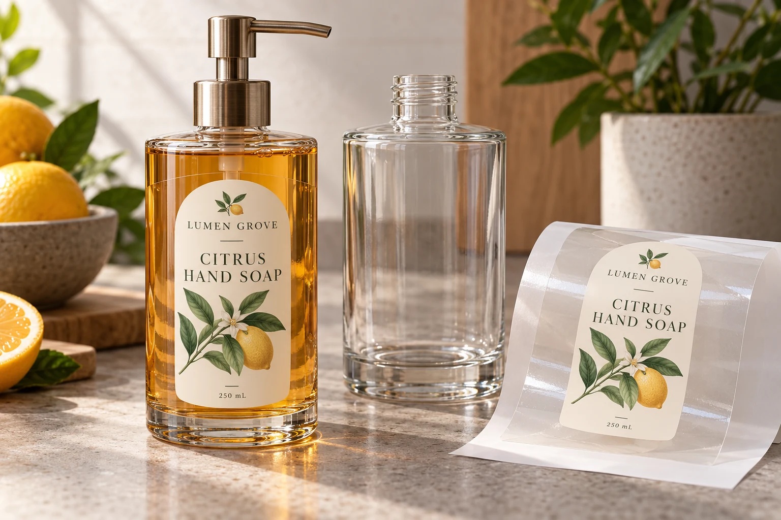
Decide what must show through
Name the visual purpose of transparency. The buyer may want the product color visible, a subtle window mark or a decorative illustration that appears to sit directly on the container. Those purposes do not necessarily require every part of the label to remain transparent.
A clear face material with selectively opaque print can leave some windows open while giving important information a more controlled background. Ask whether the intended print route can support the proposed plan. It is a construction and artwork discussion, not a promise that any clear-label quote includes white printing.
An opaque white face may be the more straightforward choice when the whole printed area needs its own background. The cost of that choice is visual: it covers the package below and makes the label shape more apparent. Evaluate the resulting composition rather than treating the visible outline as a printing defect.
Put changing package states into the comparison
Review the actual package family. A transparent container can present a different background when full, partly used or empty. Different fill colors, container tints or products visible behind a window may change the appearance even when the label file stays fixed.
Prepare a small reference set covering the states relevant to the project. Photograph them consistently enough to explain the variation, but identify the actual containers and artwork revision as well. A mockup helps identify questions; it cannot establish the finished print's exact appearance.
| Buying priority | Clear direction | Opaque white direction |
|---|---|---|
| Product visible through label | Keep intentional open areas | Move the visible area outside the label |
| Consistent printed background | Specify selective opaque print where needed | Face material supplies a white background |
| Changing container or fill color | Review the relevant states | Still review the finished print and package |
| Subtle label perimeter | Check film edge, finish and application | Treat the visible shape as part of the design |
These are design questions, not a durability ranking. A white background does not prove adhesive compatibility, and clear film does not prove suitability for wet use. The proposed face material, print, protection and adhesive still need to fit the job.
Check information hierarchy before chasing an invisible edge
The product name should be easy to identify in the intended view. Look at the longest SKU name and the information that must remain readable. If an invisible-label ambition makes those elements depend on a busy background, decide which requirement takes priority.
The white ink and small-text guide deals with the detailed print plan. Use it after deciding where opaque support is allowed. Repeatedly adjusting small text will not resolve an unresolved instruction that the entire label must both disappear and provide a solid background.
For a curved bottle, include the final label position. Moving essential information away from the visible front may create a different problem even if its contrast improves. The bottle-label layout guide helps allocate those information areas before decorative work becomes fixed.
Ask for a comparison with the differences named
Send the same final dimensions, artwork revision, quantities, delivery format and application brief with both material enquiries. Ask the supplier to identify where the proposed constructions differ. If the clear option includes selective white printing or a different protection layer, retain that difference in the comparison.
“Vinyl” should refer to an identified material direction, not every available white film. If another film is proposed, name it accurately. Likewise, “clear” describes an appearance property, not a complete material specification. Avoid approving only an informal label name and assuming the quotation resolves the rest.
A physical reference can help decide whether the clear edge, printed panel and container appearance are acceptable. Confirm what it represents. If the supplied reference uses different artwork or a different print route, describe the useful observation and the uncertainty it leaves.
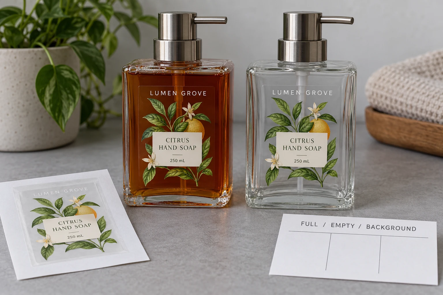
Keep the chosen direction usable across the range
An illustrative decision might accept an opaque central panel across every fill color while leaving a transparent botanical border. Another project may choose white film and move the product-viewing window outside the label. Those are alternatives, not reported orders or measured outcomes.
If variants need different treatment, record the difference by SKU. Do not let an exception disappear inside one shared approval email. Where possible, review the most demanding background and longest wording early enough that the family layout can still change.
At release, retain the face-material identity, white-print intent, finish, artwork and relevant package references together. A later change in bottle tint or contents may need a renewed appearance review even when the die-cut size remains the same.
Send ZC Labels your clear-versus-white comparison brief with package photos in relevant states, artwork, final dimensions, areas that must show through, critical text, quantities by SKU and application conditions. That information makes it possible to compare two defined design routes rather than asking a material name to decide the appearance for you.