
A pale botanical sticker looks almost painted onto a white journal page. The same artwork appears darker over a colored page and becomes harder to read where a printed grid crosses it. For a washi-style sticker collection, that interaction may be part of the appeal. It needs to be chosen deliberately rather than discovered after the finished sheets arrive.
Ask for the actual proposed material and construction. The word washi does not establish one universal opacity, writing surface, adhesive or backing. A buyer should approve how the decorative piece looks on its intended page, then check how the user handles the finished cut shape.
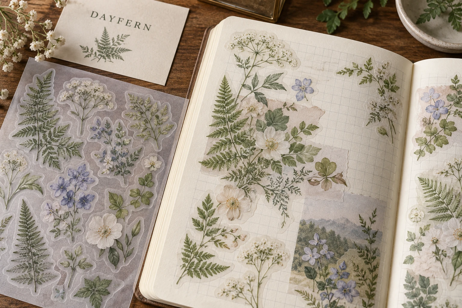
Separate the applied face from its release backing
A sticker viewed on its carrier may not show its final appearance. Identify the face that remains on the page and the liner removed during application. A clear carrier does not by itself make the sticker face transparent, just as a white backing does not prove that the applied design is opaque.
StickerHD's washi product description gives an example of a semi-transparent matte face with a clear PET liner. It describes that supplier's product. Obtain the chosen supplier's own construction and sample instead of treating the name as an interchangeable material specification.
Approve the background interaction
Choose representative receiving pages: the intended white or cream paper, any colored stock, and relevant printed rules or grids. Apply equivalent artwork specimens so the background is the variable under review. Identify which areas should blend and which words or outlines must remain recognizable. A backing-only photograph cannot answer that applied-page decision.
Layering is a separate design state. If the collection is intended for collage, compare a single piece with the intended overlapping arrangement. Keep essential text out of a busy overlap if it becomes difficult to read. The owner can choose softer blending, simplify the illustration or select a more opaque construction; each changes the product's appearance.
| Reference state | Buyer checks |
|---|---|
| Unapplied piece on its carrier | Artwork identity, supplied outline and peel access |
| Applied to the intended plain page | Color relationship, edge appearance and essential detail |
| Applied over a grid or illustration | Whether underlying marks interfere with the intended reading |
| Deliberate overlap | Whether the layered result still supports the collection's use |
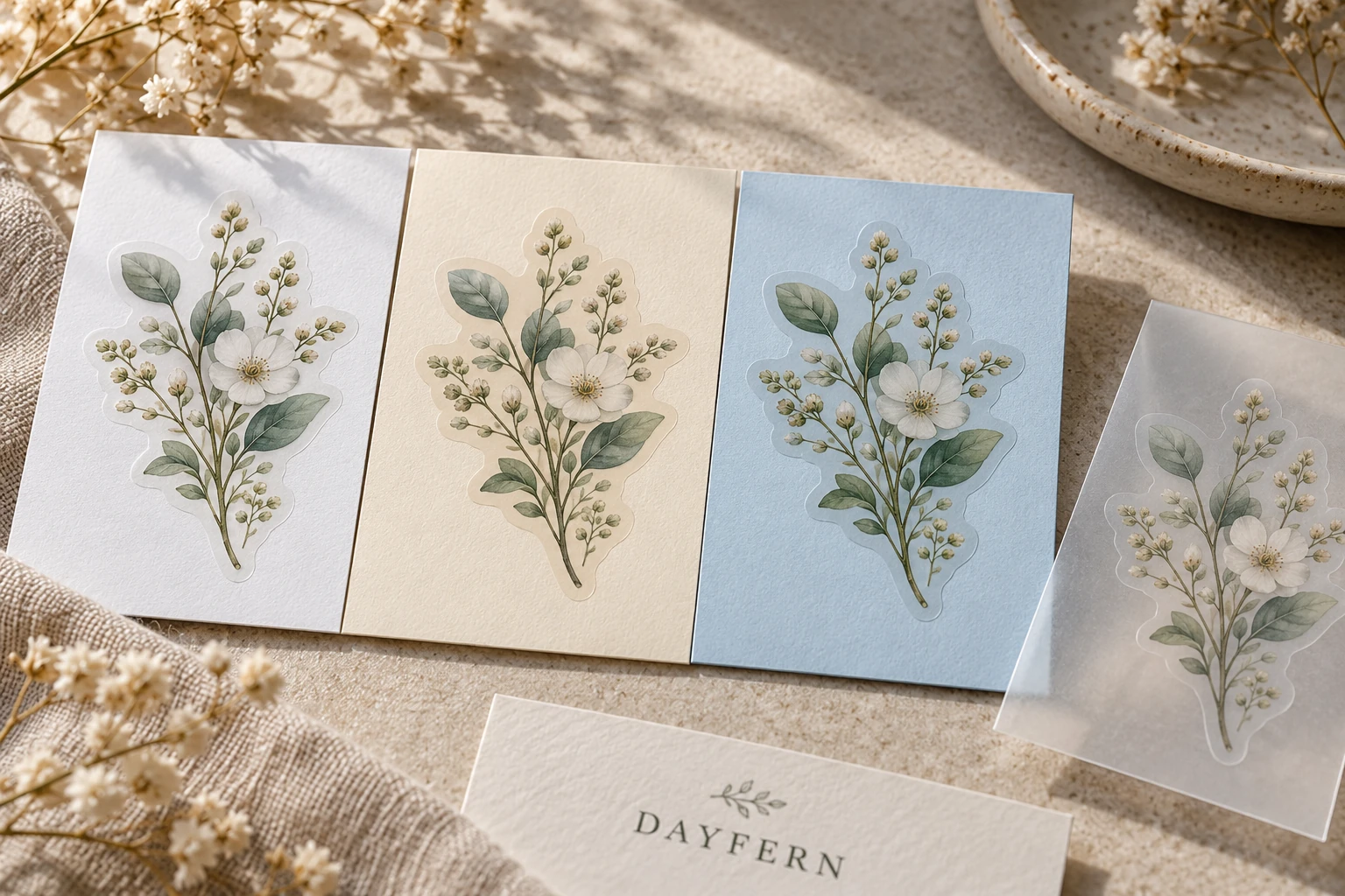
Review the smallest piece in the user's sequence
Use a representative converted specimen to start peeling a narrow stem, small leaf or other difficult shape. Observe the actual sequence without diagnosing the material from an image. If access or handling is awkward, discuss a simpler contour, different spacing or another carrier arrangement with the converter. Avoid assigning a universal minimum stem width from an attractive mockup.
Repositioning and removability need their own agreement. A soft paper appearance does not establish that the piece can be lifted repeatedly or removed cleanly from every notebook. State whether ordinary use is one application or includes repositioning, and have the supplier review the actual receiving paper and relevant conditions.
Keep writing and environmental claims specific
If users write on the pieces, identify the intended tool and printed area, then review the proposed combination. A matte surface is not a guarantee for all pens. The planner-sheet guide covers writing, page closing and partly used sheets in more detail.
Do not infer recyclability, biodegradability or a disposal route from a paper-like face. The complete item includes adhesive, liner and any other layers. Obtain applicable documentation for the specific construction and market before making a claim. The environmental-claim evidence guide provides that separate review route.
Freeze the material reference with the artwork
Retain the accepted material reference, artwork version, cutline, receiving-page references and observed applied states. When a pale color, page stock or face construction changes, identify which comparisons must be repeated. A reorder that keeps the same illustration may still produce a different visual result if its underlying materials change.
For a washi-style sticker discussion, send the collection artwork, proposed shapes and sheet dimensions, intended page samples or photographs, desired blending versus opacity, any writing or repositioning needs, quantities by layout and packing requirements. Ask the supplier to confirm the available construction and a suitable sample route before approving it for the collection.