
The artwork shows a gold leaf crest. The purchasing note says embossed, but the reference supplied is a flat photograph. One person expects a raised detail they can feel. Another expects a bright metallic highlight. Both can approve the same picture while ordering different physical results.
Start by deciding whether the project needs actual relief. Mark the feature that should rise or recess, then identify a physical reference for that profile. Choose its color and reflective appearance separately. An attractive metallic effect can be the right answer when the requirement is visual; it cannot settle an unreviewed tactile requirement.
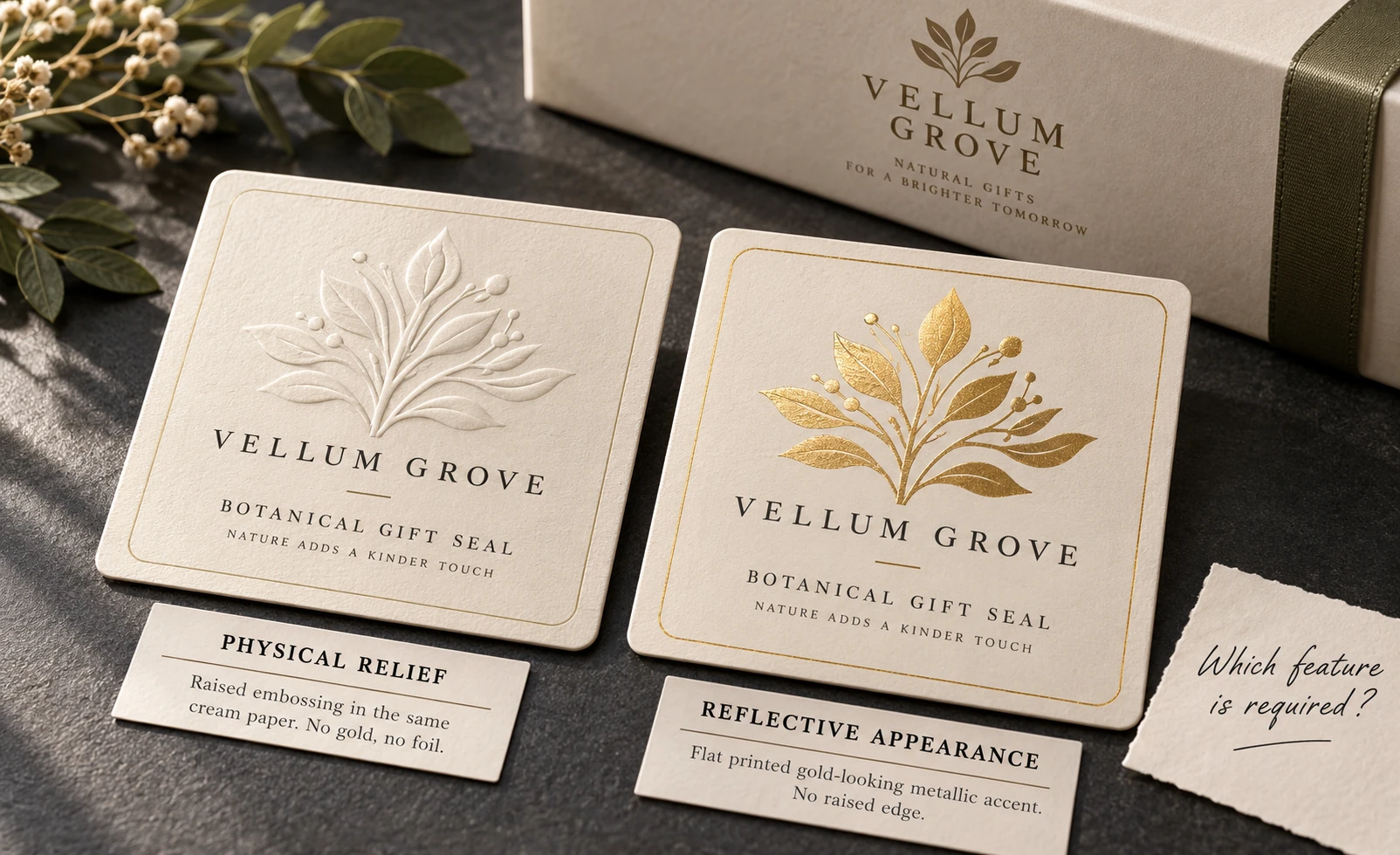
Say what the buyer expects to feel
Identify the motif, its intended direction and the side from which the finished label will be judged. Does the buyer want a raised leaf, a recessed mark, a printed texture effect or simply a reflective accent? Avoid using embossed as a general adjective for all four.
Put that requirement beside the final-size artwork. A broad crest and a fine outlined drawing present different details for a supplier to assess. Mark the smallest relevant line and the areas whose separation matters. Do not invent a universal minimum stroke, depth or gap from a photograph of another job.
The supplier needs to explain the available process and construction for that design. This guide does not confirm that ZC Labels offers a particular embossing route, tooling system or relief height. Establish availability before treating a visual direction as a production specification.
Keep relief and transferred decoration separate
KURZ's process explanation distinguishes blind embossing from foil transfer: the blind impression does not transfer stamping foil. That distinction is enough to prevent a common specification error. A requirement for shape alone and a requirement for a metallic surface are not interchangeable instructions.
For a combination effect, ask which operations the proposed reference actually represents. Is the relief registered to printed or reflective artwork? Which part changes shape and which receives decoration? Have the supplier describe the proposed result instead of prescribing a machine setting or assuming that every foil impression provides the same profile.
The foil versus metallic ink guide addresses the optical choice. Use it if the team only wants a highlight. This page addresses the additional decision that remains when the physical shape itself is part of the accepted result.
Ask for the reference that answers the open question
A digital mockup can explain where the motif belongs. It cannot establish the actual profile or hand feel. A stock embossed sample may demonstrate a process, but its material, detail and shape may differ from the proposed label. Record those differences before making it the order standard.
Ask what a project-specific physical reference can represent and which parts remain approximate. If the reference uses a different material or does not include the intended protection, do not silently extend its result to the complete construction. Obtain the available scope, timing and cost before requesting further sampling.
| Requirement | Useful reference | Remaining question |
|---|---|---|
| Motif position | Identified artwork at final size | How will the proposed construction reproduce it? |
| Raised or recessed appearance | Physical reference with viewing side marked | Is it representative of the order? |
| Touch and edge impression | Appropriate finished sample | What differs from the proposed bulk route? |
| Metallic highlight | Identified reflective finish reference | Does it also represent the specified relief? |
| Applied appearance | Representative sample on the actual package | Which use conditions remain unreviewed? |
The buyer does not need to demand every reference immediately. First name the uncertainty that could change the order. A stock sample may resolve an early direction; a committed tactile requirement needs evidence appropriate to its final detail.
Review the motif on the finished package
Locate the relief relative to the label edge, seam, package curve and areas handled during use. Ask the supplier which placements need revision for its proposed route. A dramatic loose sample may be less useful when the motif falls across the part of the package the buyer cannot normally see or touch.
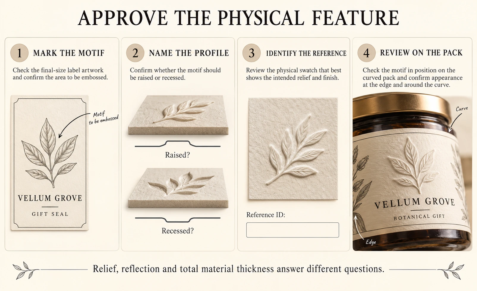
Compare the actual sample under ordinary viewing conditions and by the agreed handling. Record the feature being accepted, rather than selecting the one tilted photograph with the deepest-looking shadow. Lighting can help explain relief while also exaggerating it. A photo should preserve the reference's identity and limitations.
If essential wording competes with the decorative feature, keep the wording readable and reconsider the motif's size or position. The content owner decides what information must remain available. A decorative treatment should not quietly replace that decision with a small unreadable line.
Compare the alternative that meets the real purpose
If the team needs shelf contrast rather than physical shape, a flat printed or reflective solution may be sufficient. If touch is important, an optical simulation may leave the main requirement unanswered. A different motif, larger feature or simpler construction can also deserve comparison where the original design is unsuitable.
Ask for quotations against the same artwork scope and clearly identify any separate tooling or setup. Do not claim that embossing always costs more by a fixed amount, or that an existing tool can automatically be reused. Availability, ownership, storage and suitability need confirmation for the actual route.
Keep the thickness-basis guide separate from this discussion. A material thickness describes a defined measurement boundary; it does not by itself specify the profile of an impressed decorative motif. Two numbers or two photographs cannot replace a named physical reference.
For an embossed-label feasibility enquiry, send layered artwork, final dimensions, the raised or recessed areas marked, package photographs, any physical reference, quantity by design and destination. Use the decorative label project route to explain whether tactile relief is required or only a visual effect. Those inputs let the supplier confirm the available construction and evidence before a gold-looking proof is mistaken for approval of a shape nobody has felt.