
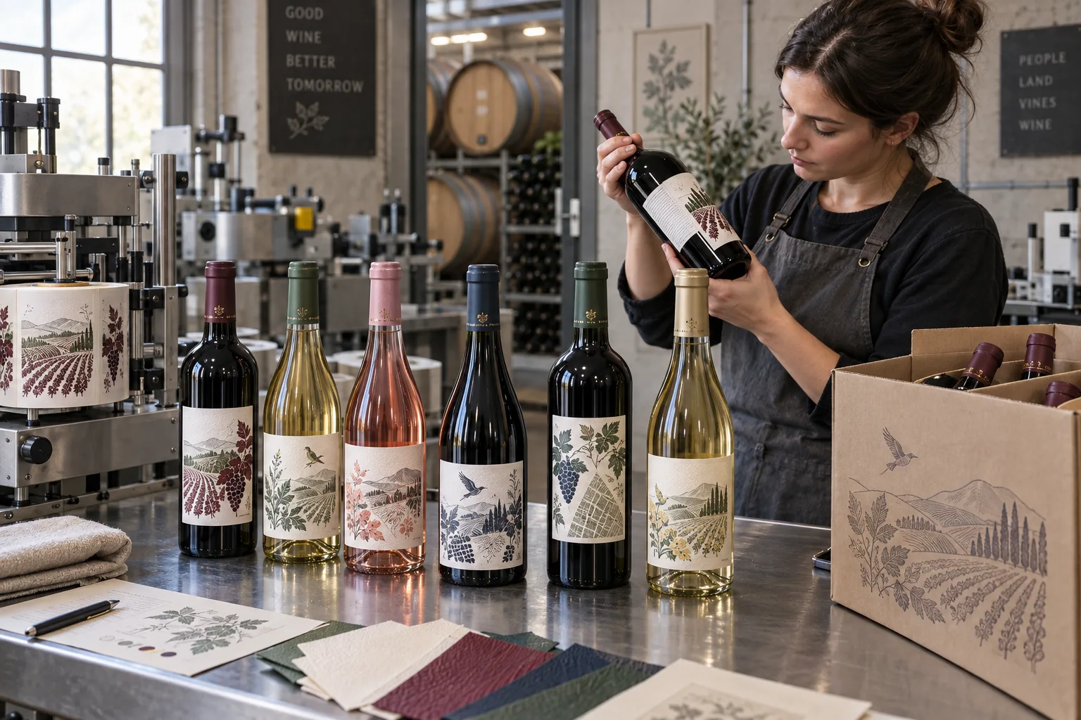
Wine labels invite people to talk about paper, foil and restraint. Those choices matter, but the first production question is less romantic: which bottle is actually being used?
Burgundy, Bordeaux, sparkling and specialty bottles offer different straight panels, shoulders and diameters. A front label designed before the bottle is locked can end up climbing a curve or sitting too close to the base.
Build the Dieline Around the Bottle, Not the Rendering
Measure several final bottles and mark the usable front, back and neck areas. If the bottle has a strong mold seam, decide whether the front label centers between seams. Apply paper prototypes and view the bottle upright, in a case and on a shelf.
For front-and-back sets, define spacing and alignment. For wraps, decide where the seam or overlap lands. A millimeter that looks trivial on screen can become obvious when twelve bottles stand in a carton.
| Presentation choice | Production question | Test focus |
|---|---|---|
| Textured paper | How much moisture and abrasion? | Application, cellar storage and handling |
| Gloss or film | How will glare affect the artwork? | Shelf and photography readability |
| Foil or metallic detail | Which areas need contrast? | Proof, fine lines and bottle viewing angle |
| Front and back labels | How are they aligned? | Applicator setup and visual spacing |
Premium Does Not Mean Empty
Original vineyard rows, grape clusters, local plants, birds, hills, cellar tools and geometric maps can give wine packaging real character. Avoiding a copied ch芒teau crest does not require a plain white rectangle with one word in the center.
Decide what the illustration contributes. It might separate grape varieties, distinguish a reserve line or express landscape. Keep the producer name and wine type readable. The artwork should reward a closer look without hiding the buying decision.
Paper Texture Has a Real Handling Cost
An uncoated or textured paper can feel warm and tactile. It may also react differently to condensation, wet ice service, abrasion or adhesive squeeze-out. A protected construction can improve resistance and change the feel. There is no universal premium material.
Test labeled bottles through the actual route: application, case packing, cellar or refrigerated storage, transport, retail handling and service. If the wine enters an ice bucket, say so before material selection, not after the first complaint.
Plan for Vintage and Market Changes
Vintage, alcohol content, importer details, geographic statements, barcodes and awards can change. Separate stable artwork from controlled variable fields. Name files so the vintage and market are visible before anyone opens them.
Do not print an award medallion, appellation symbol or sustainability mark without permission and evidence. Original visual authority is welcome; invented official authority is not.
Our Wine Label Test List
- Confirm the exact bottle family and color
- Measure straight panels on several bottles
- Apply front, back and neck paper prototypes
- Check artwork contrast against dark or clear glass
- Run cellar, condensation and ice-service tests as relevant
- Pack into the final case and inspect scuffing
- Verify vintage, market and award versions
- Keep an approved filled bottle for reorders
What We Would Put in the Quote Request
Send bottle specifications, filled photos, label dimensions, front/back/neck arrangement, wine varieties, vintages, quantities, artwork, material and finish direction, storage and service conditions, application method, destination markets and case packing.
A wine label earns its quiet confidence after the production details are settled. Then the paper, illustration and finish can speak without asking the customer to ignore a lifting corner.