
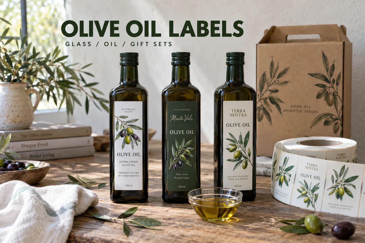
An olive oil bottle can look excellent in a brand presentation and become awkward the first time someone pours from it. Fingers touch the front. A trace of oil runs past the neck. The bottle goes back into a gift box with its label against a divider. I would build a custom olive oil label around that route before choosing a decorative finish.
The commercial temptation is obvious: promise an impressive paper, add a foil detail, and get the quotation out quickly. My preference is to ask one slower question first: what does the bottle look like after filling and wiping? A photograph of that bottle can save more discussion than another mood board.
Measure the Bottle That Will Actually Be Filled
Round bottles, square bottles and tins provide different label panels. Measure the area between the shoulder and base transition, then check several containers from the intended supply. A front label should sit comfortably inside that area. A wrap needs a planned seam, and a square bottle needs its corners treated as a separate application question.
Consider a small producer offering a kitchen bottle and a taller gift bottle. Reusing one front design can help recognition, but reusing one dieline may put the second label on a curve. I would keep the graphic system and measure the two packages separately. Record finished width and height in mm, not just bottle capacity in ml.
| Detail | Information to provide | What the review should resolve |
|---|---|---|
| Dark or clear glass | Filled bottle photo | Artwork and small-text contrast |
| Usable label panel | Width and height in mm | Shoulder, corner and base clearance |
| Oil exposure | Filling, wiping and pouring routine | Material and print protection trial |
| Front and back set | Placement photo or drawing | Alignment and spacing |
| Gift presentation | Box and divider sample | Scuffing and visibility after packing |
Paper Feel and Oil Handling Can Pull in Different Directions
A textured paper can suit a farm shop or a restrained premium range. A film-based label may be worth discussing when repeated oily handling is central to the product. Neither description selects the adhesive, print system or finish for you. The complete construction needs a trial.
I would resist calling every oil-related problem a reason to abandon paper. A bottle kept dry in a fitted gift box has a different life from a refill bottle on a restaurant table. Ask how much protection the first product needs and how much tactile character the second choice loses. There is room for both decisions when they follow the actual use.
Give the Olive Artwork a Job
Original olive branches, fruit clusters, grove contours and harvest illustrations can make the range distinctive. They also let a buyer recognize a variant before reading the fine print. Avoiding another producer's identity does not require an empty label. The useful question is what this artwork helps the customer understand.
Keep product identity, variant and volume easy to locate. On clear film, mark any white ink backing needed for contrast. View the design on the actual dark or green glass. An illustration with attractive pale leaves can disappear once the white artboard is replaced by a filled bottle.
Separate Stable Design From Harvest and Market Versions
Harvest, blend, bottle size, language and customer information may change while the main design stays the same. Build a version list with a file name, container and quantity for every SKU. If a claim, quality grade or origin statement appears, the responsible seller should provide and approve it; the printing review checks that the approved text is reproduced clearly.
For example, a planned run of 2,400 bottles across three blends does not necessarily mean 800 of each. That is a planning example, not a factory minimum. Quote the real split. A slower-selling gift blend can leave more unused labels than a small difference in unit printing cost ever saves.
Test the Finished Package Through a Normal Pour
- Apply to bottles prepared as they are on the filling line
- Record the surface condition and application temperature
- Handle and pour from the bottle during a defined trial
- Check edge lift, staining and print transfer after wiping
- Pack and unpack the actual gift box or shipping case
- Compare front and back alignment on several bottles
- Retain the approved file, labeled bottle and material reference
Send those notes with the artwork, dimensions, quantity by variant, application method and packing plan. Our label specification planner keeps open questions visible. The bottle and jar roll label guide explains format choices, while the surface matching guide helps organize adhesive questions.
I would rather approve one bottle that has been poured from than ten untouched renderings. The attractive label still matters. It has simply earned its place on the bottle.
Questions Before You Order
Which material should I use for olive oil bottle labels?
Describe the bottle, application condition and oil exposure first. Paper or film constructions should be reviewed and tested on the actual filled bottle; the material name alone does not establish performance.
Can a clear label work on a dark olive oil bottle?
Yes, but dark glass and oil change contrast. Review any white ink areas and the smallest important text on a labeled bottle, rather than only on a white screen.
What should I send for an olive oil label quote?
Send the bottle photo, usable panel dimensions in mm, front and back arrangement, artwork versions, quantity per SKU, application method, packing and destination market.