
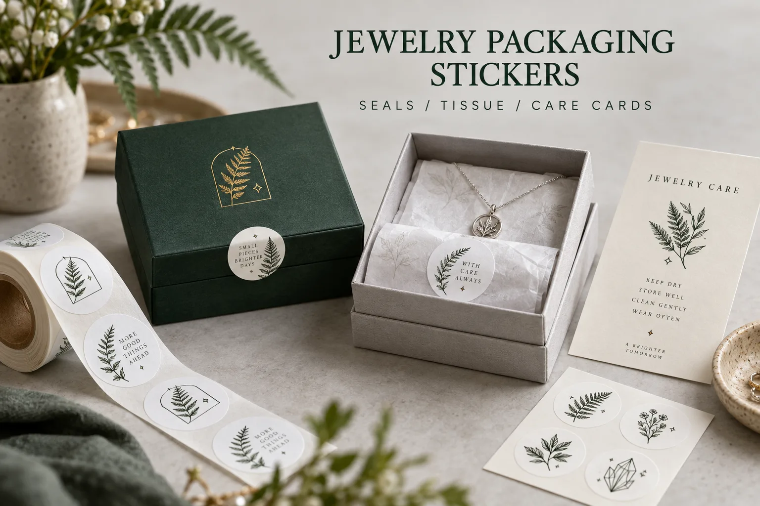
Jewelry packaging has a small stage and an impatient audience. The customer lifts the lid expecting a necklace or a ring. If a decorative seal tears the box finish or makes the lid awkward to open, the sticker has taken more attention than it deserves. That is where I would start a custom jewelry packaging project.
I like a well-designed seal. Original botanical lines, geometric marks, initials and tiny illustrated motifs can make a modest box feel considered. But I would not treat every extra finish as an upgrade. The opening, the packing routine and the useful information on a care card come first.
Decide Whether the Sticker Seals, Decorates or Informs
A seal across the lid changes how a package opens. A sticker on tissue holds a fold together. A label on the back of a care card may identify a collection or connect the customer to care instructions. These are different jobs, even if the same artwork appears on all three.
Consider a maker shipping a small run of silver pendants and a retailer preparing gift sets. The maker may want flexible collection labeling across standard boxes. The retailer may need consistent placement and speed across a packing team. I would compare those workflows before deciding that both need a large custom-shaped sticker.
| Placement | Main question | Trial on the real package |
|---|---|---|
| Box lid seam | How should it open? | Lift the lid and inspect the box finish |
| Tissue fold | Must the paper remain intact? | Close, handle and open the fold |
| Care card | Which information changes? | Check reading and code placement |
| Outer mailer | Decoration or closure? | Inspect after packing and opening |
| Retail display | What remains visible? | Check shelf and hand-held presentation |
Small Dimensions Make Every Detail More Expensive
By expensive, I mean in attention as well as production. A fine illustration, small slogan and decorative border can compete on a tiny seal. Print the artwork at final size. Place it on the actual box. Ask a colleague to open the package without instructions.
If the customer cannot read the brand or find the opening point, more foil will not solve the hierarchy. I would keep one recognizable symbol and a clear name. A round label may be enough. A die-cut shape earns its place when the silhouette makes the packaging easier to recognize, not merely because the option exists.
Let the Package Finish Decide the Test
Coated boxes, textured paper, soft-touch finishes and tissue should not be treated as one surface. The intended opening method also matters. A reusable gift box may need a different seal behavior from a disposable outer wrap.
Test with the actual box finish and the agreed time before opening. Record whether the goal is secure retention, an opening cue or clean removal. If the buyer wants a seal to show evidence of opening, discuss that requirement separately from the attractive artwork. A printed crest does not establish security performance.
Original Identity Is More Useful Than Empty Restraint
A tiny fern, a geometric stone shape, a hand-drawn flower or a well-spaced monogram can belong naturally on a jewelry box. Those are complete design choices. Avoiding another brand's recognizable mark does not mean abandoning all symbols.
Build a small visual family across the box seal, tissue and care card. The sizes can differ while the main symbol stays consistent. For foil or reflective details, agree which part of the identity needs the effect and which part needs ordinary readable print. Keep care instructions and any code easy to find.
The Packing Team Gets a Vote
A beautiful tiny seal can slow packing when the peel area is difficult to find. Compare roll and sheet supply with the people applying the labels. Orientation, peel access, sheet organization and counted bundles can all affect the daily routine.
As a planning example, a set with one box seal, one tissue sticker and one care-card label uses three different placements. A quote for 1,000 sets needs that breakdown, not an ambiguous request for 1,000 stickers. List dimensions in mm and quantities for each item.
- Define the job at each placement
- Measure the usable area on the final package
- Review artwork at actual printed size
- Test opening on the actual finish and tissue
- Confirm roll, sheet or individual supply
- Allocate quantities to each collection and placement
- Approve a packed set as the reorder reference
Start with custom gift stickers, compare rolls and sheets, and assemble the inputs in our specification planner. I would finish by opening one packed order. When the sticker does its job quietly and the jewelry gets the attention, the design is in the right place.
Questions Before You Order
Can I use one sticker for jewelry boxes and tissue paper?
Possibly, but the surfaces and opening requirements differ. Test the proposed construction on both materials before treating one label as suitable for both.
Should a jewelry box seal be removable?
Decide how the customer should open the package and whether the box is intended for reuse. Then test the agreed retention or removal behavior on the actual finish.
What makes a jewelry packaging sticker look professional?
A clear brand symbol, final-size readability, controlled placement and a clean opening experience matter more than adding many special finishes.