
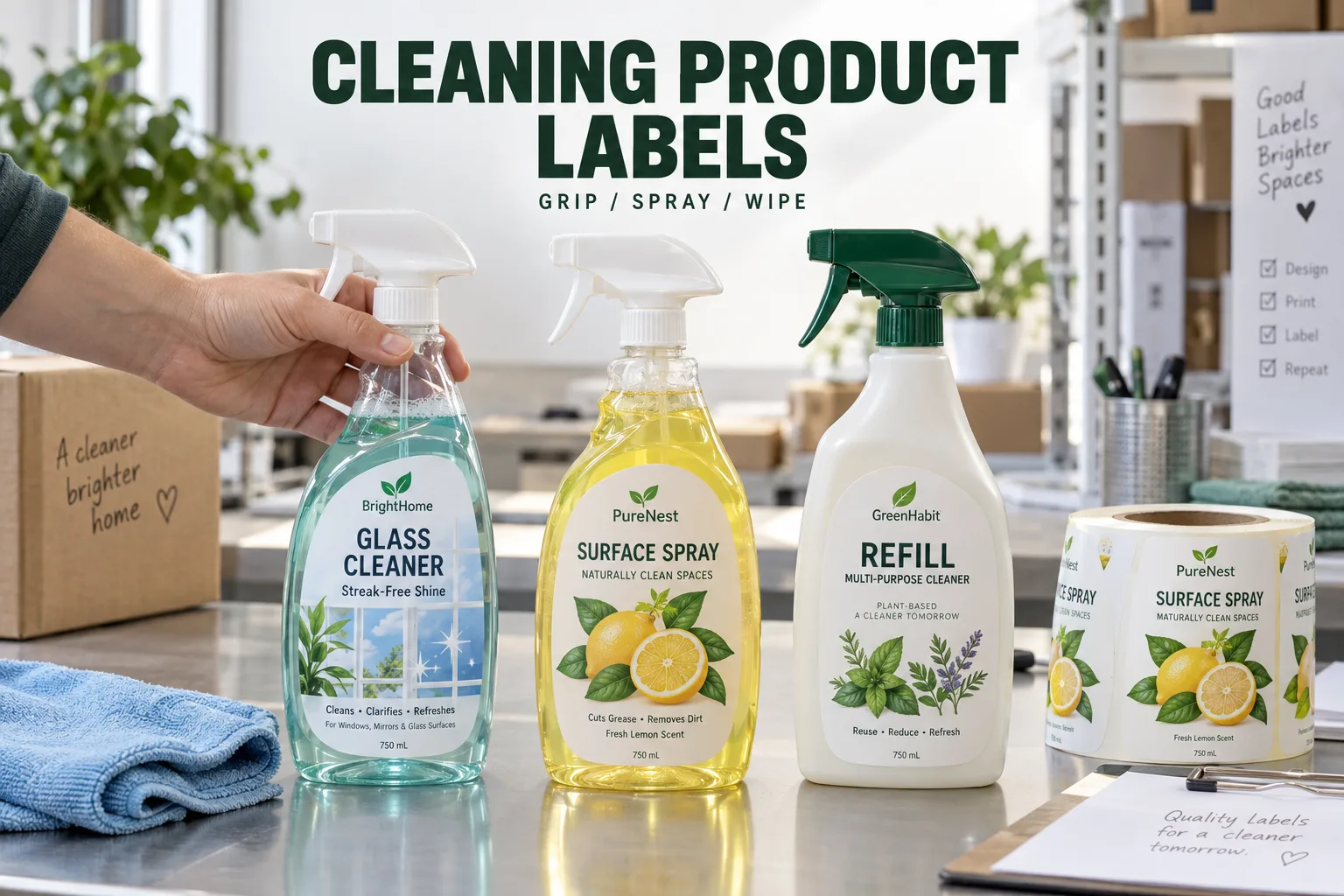
A spray bottle is bought upright and used at an angle. That simple change is where I would start a cleaning product label review. The customer grips it, pulls the trigger, puts it on a wet counter and wipes the side. A label that works only in a shelf photograph has completed the easiest part of the job.
I can understand why a buyer asks for a waterproof sticker first. It is a quick way to describe the worry. But I would ask what is inside the bottle and what reaches its outside. Water, the actual cleaning formula and repeated wiping are different test conditions. One broad adjective leaves too much room for both parties to imagine different results.
Map the Grip Before Enlarging the Front Label
Check the exact bottle mold, including recesses, seams, shoulders and textured areas. Hold the filled bottle in a normal spraying position. Note where fingers cover the product name and where they rub the label edge. A larger front label can create more problems if it crosses a difficult curve.
Consider two planned products: a household surface spray and a refill bottle supplied to a workshop. The first needs quick recognition and comfortable use. The second may prioritize large directions and repeated identification. I would not force them into the same layout merely because they share a brand color.
| Use condition | Trial to agree | What to inspect |
|---|---|---|
| Routine spraying | Use the filled final bottle | Grip, edge rubbing and product recognition |
| Formula splash | Define product, contact and wiping | Print change, staining or edge movement |
| Wet storage | Use the intended storage route | Backing and adhesive behavior |
| Repeated handling | Agree a handling trial | Small-text and graphic legibility |
| Refill or reuse | Describe the expected lifecycle | Label retention or removal requirement |
Specify the Whole Construction
A film face material may be a useful direction for wet handling, but it does not settle the ink, protection, adhesive or liner. Ask the supplier to identify the proposed construction and the purpose of the sample. A dry display sample answers an appearance question. A labeled production bottle answers an application question.
A simpler label without a special finish may win when the buyer needs a clear, stable identifier. I would gladly give up a decorative detail if it obscures directions or adds a surface the cleaning routine has not tested. The buyer is paying for a finished working package, not our enthusiasm about a print effect.
Original Graphics Should Improve Recognition
Citrus illustrations, botanical drawings, window grids, tile patterns and clear geometric symbols can separate a cleaning range. A kitchen spray and a glass cleaner should be distinguishable even before the full name is read. Use customer-owned or original artwork and give each visual element a purpose.
Keep decorative symbols distinct from product-owner-approved warning or instruction content. Never substitute a cheerful icon for required information. If the product owner supplies official symbols, preserve the supplied artwork and verify its final-size readability with the owner. The printer's illustration is not a substitute for the product specification.
Build the Back Label Around Real Reading
Directions often lose space to a large illustration, then get reduced until nobody wants to read them. Print a paper layout at final size and hold it on the bottle. Review the hierarchy: product identity, directions, important notices, contact information and any variable coding area.
Clear film also needs attention to the bottle and liquid behind the text. Pale lettering on a translucent bottle can appear convincing on screen and weak in a storeroom. Mark white ink or opaque text areas in the artwork instead of leaving them as an assumption.
Keep Similar Bottles From Becoming Similar Mistakes
For a planning example, five 500 ml variants might share one bottle but need different directions, names and quantities. Build a SKU sheet with one approved file per version. Do not treat a color change as proof that all the text was updated. The operator should identify the right roll without opening every artwork file.
- Confirm bottle material and mold
- Mark usable front and back panels in mm
- Identify grip and abrasion zones
- Describe formula exposure and wiping
- Approve final-size direction and warning content
- List artwork versions and quantities separately
- Confirm hand application or applicator setup
- Retain a tested, labeled bottle for reorder comparison
Prepare the brief in our specification planner, then compare custom roll labels and the wet-use buying checklist. A useful quote begins with the bottle someone actually holds. That is where I would put the effort first.
Questions Before You Order
Are waterproof labels enough for cleaning products?
Water exposure is only one part of the job. Describe the actual formula contact, wiping, surface material, grip and storage conditions, then test the proposed label construction.
Where should I place a label on a trigger spray bottle?
Use the intended label panel and check the filled bottle in the normal grip position. Avoid assuming a shoulder, recess or textured grip will behave like a flat panel.
Who supplies warning and direction text for cleaning labels?
The responsible product owner supplies and approves the market-specific text and any required symbols. Artwork review checks placement and legibility of that supplied content.